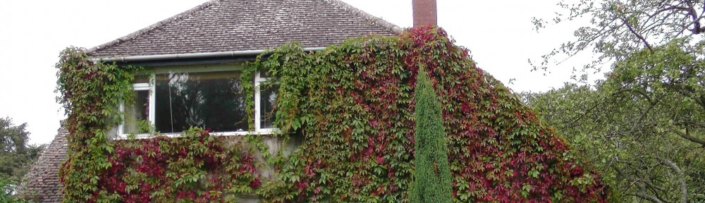
Let’s not mince words here: Westacre’s house is ugly.
I fear it may well have been quite a smart 1930s house before Alex’s parents got their hands on it. They were the ones who replaced the rounded bay windows with a square bay. They bricked up the original front door. And they decided that the grey Tyrolean render was a good idea.
What do you think?
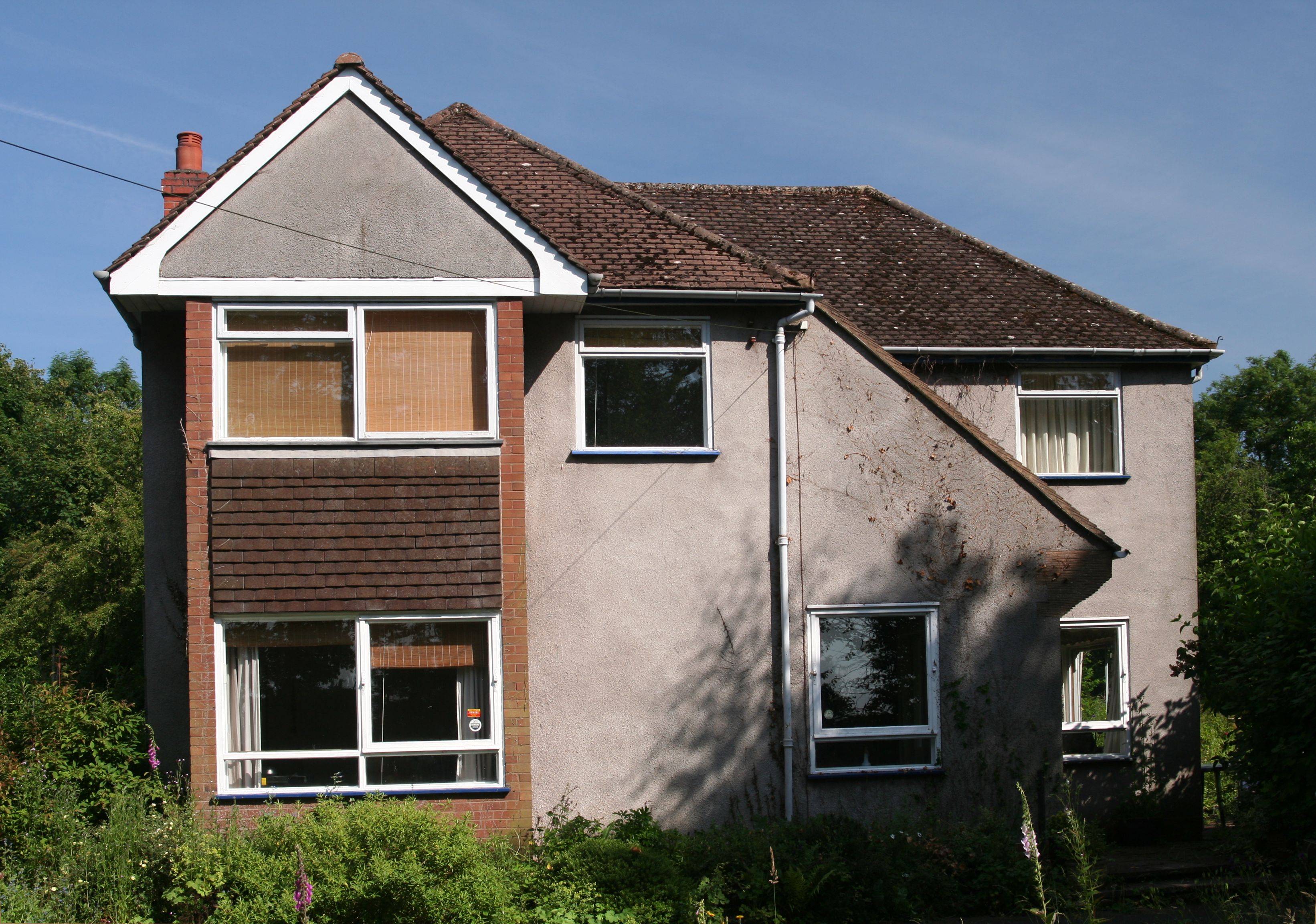
Westacre as it looks now.
We would like to remodel this frontage and make it look better. We are aiming to take the design about 25 years further into the past. We’re going for Edwardian smart.
Of course, you can do things to a house and you’ll only really know what the result looks like when you have spent all the money on brickwork, new windows, a modified roof and insulation. To give ourselves some sort of idea, Alex has spent a few days working on a photoshop pre-visualisation of what we’re aiming for.
As you can see, we will be putting the front door back where it used to be. The house instantly looks more comfortable with itself. We are also going for smaller windows. Not just because we like them better, but also because this is the NW side of the house, that gets all the nasty cold and wet weather. Smaller windows will help us keep it warmer.
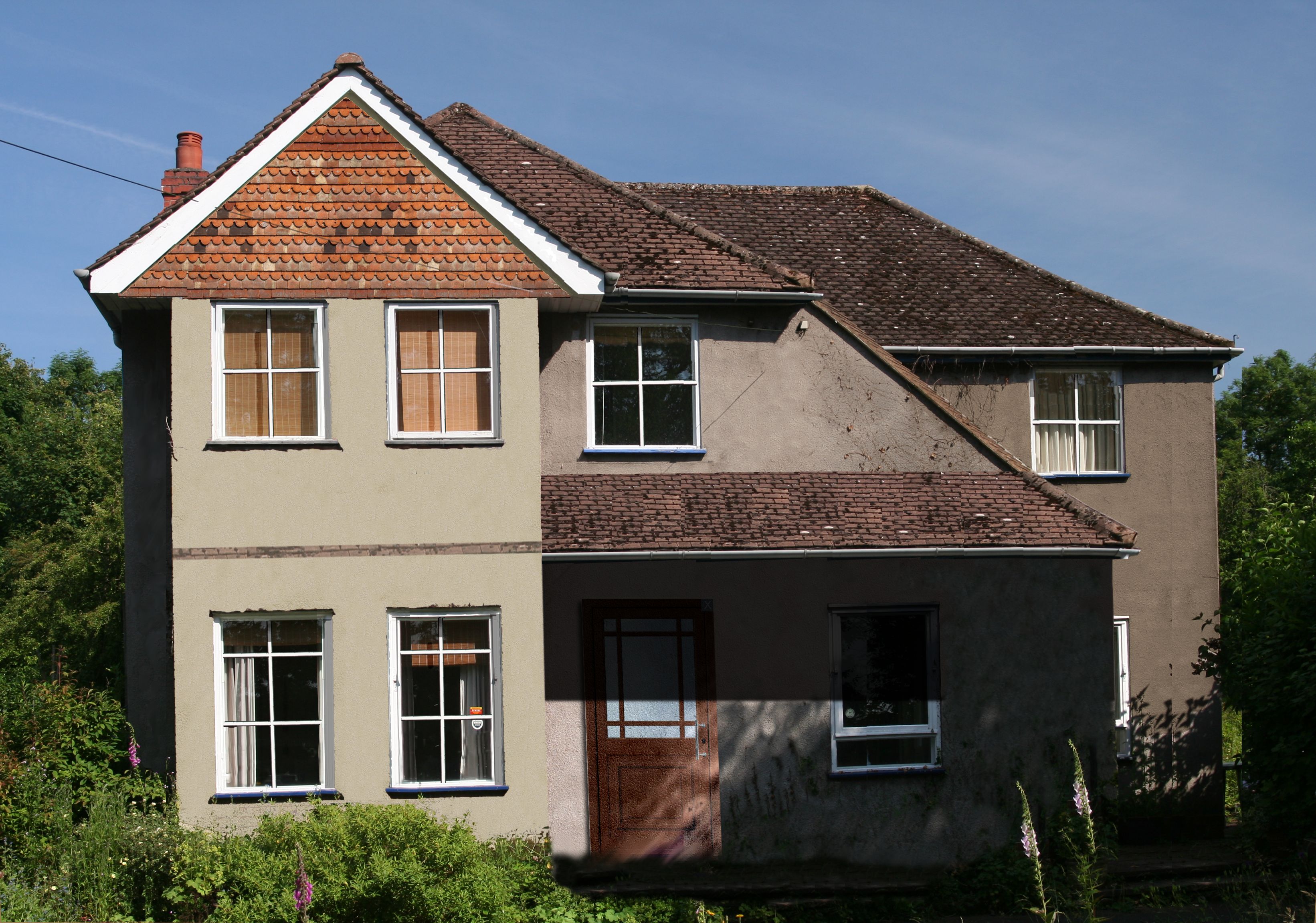
An impression of what we’re aiming for.
If you compare the two pictures, you will also notice that everything looks a little wider. This is because of the 10 cm thick external wall insulation we will be installing. We’ll also have to extend the eaves of the roof a little, to accommodate the insulation panels.
With some nice windows and tiles making a feature out of the pointed gable, we think it looks quite smart. The porch across the front gives it some added romance and will also keep callers dry. I can just imagine myself sitting in a rocking chair out there, watching the sunset.
I like the change of windows, which lifts it a lot (assuming they’ll be double glazed?) and the extra roof area (assuming the ground floor at the front isn’t made too dark thereby).
On the aesthetic side, I’m not sure about the terracotta tiling in the triangle at the front, rather than say, matching tiling or some timber detailing. Losing the white edge at the bottom doesn’t seem to help. However that might just be the version of tiling you got for the mock-up.
Hi Antonia,
Thanks for your comments.
Yes, the windows at the front will be triple glazed. We’re going for passive house type windows throughout.
We’re not too worried about the porch roof making the front of the house dark. This is the dark side of the property anyway, and any direct sunlight it gets would be low.
The tile in the triangle is just a texture Alex found on the internet. We played around a bit with timber detailing etc, and this actually looked better. The finished product will vary, though.
That gable end is going to be the hardest thing to get right. We both think that hung tiles might work, hence the (admittedly crude) image. I would like to consider “Art & Crafts” style horizontal boards, but Hilde has an aversion to that. Adding mock Tudor woodwork might be an option too – I think that’s what it had originally. I’m tempted to replace the plain fascia boards with some scroll-work – you see that quite often on houses round here, and it works quite well.
Fortunately, it’s probably also the easiest thing to play with. If we get the windows wrong, it’s going to be a very expensive mistake. But we can change tiles to mock Tudor relatively easily.
Do you know, I never even noticed that the front door is/was missing. I only considered the people inside rather than what the house actually looked like. oh and the wild garlic plants by the front gate!!
Hi Jill,
I know what you mean. The inside is much better than the outside. But now we are doing things to the outside, the aesthetics are obviously important.
Years ago, Molly was dissatisfied with the look of the frontage, but didn’t know what to do with it. And since we are doing lots of work, we’re going for something completely different.
Will the grey render stay grey, or will you re-colour?
Hi Dave,
That is actually re-coloured. Though I must admit, it hasn’t been tremendously successful. As Alex says: there are only so many photoshopping hours in a day.
What we are going for is a sort of coffee colour, getting darker as the walls recede. So not Grey. It’ll be a relief!
What sort of render are you planning to use, cement or lime. The photo looks like it’s textured? Are you planning to ‘paint’ the render or have it coloured from the start?
By th way I think the proposed changes make a great immprovement.
The tudor look may be easier to achive as it may be difficult to match the tiles.
I’m glad you think it’s an improvement, Mark. But then, the starting point isn’t hard to improve on, is it?
We are wrapping the entire house in external wall insulation, using phenolic board. The render that goes on top of that may be cement or acrylic based – it’ll depend on the exact system we end up buying. The render comes pre-coloured.
For more on the external wall insulation see: http://www.westacre.org.uk/2013/06/13/sheeps-wool-vs-phenolic-board-how-we-made-the-choice/
including Alex’s comments on condensation.